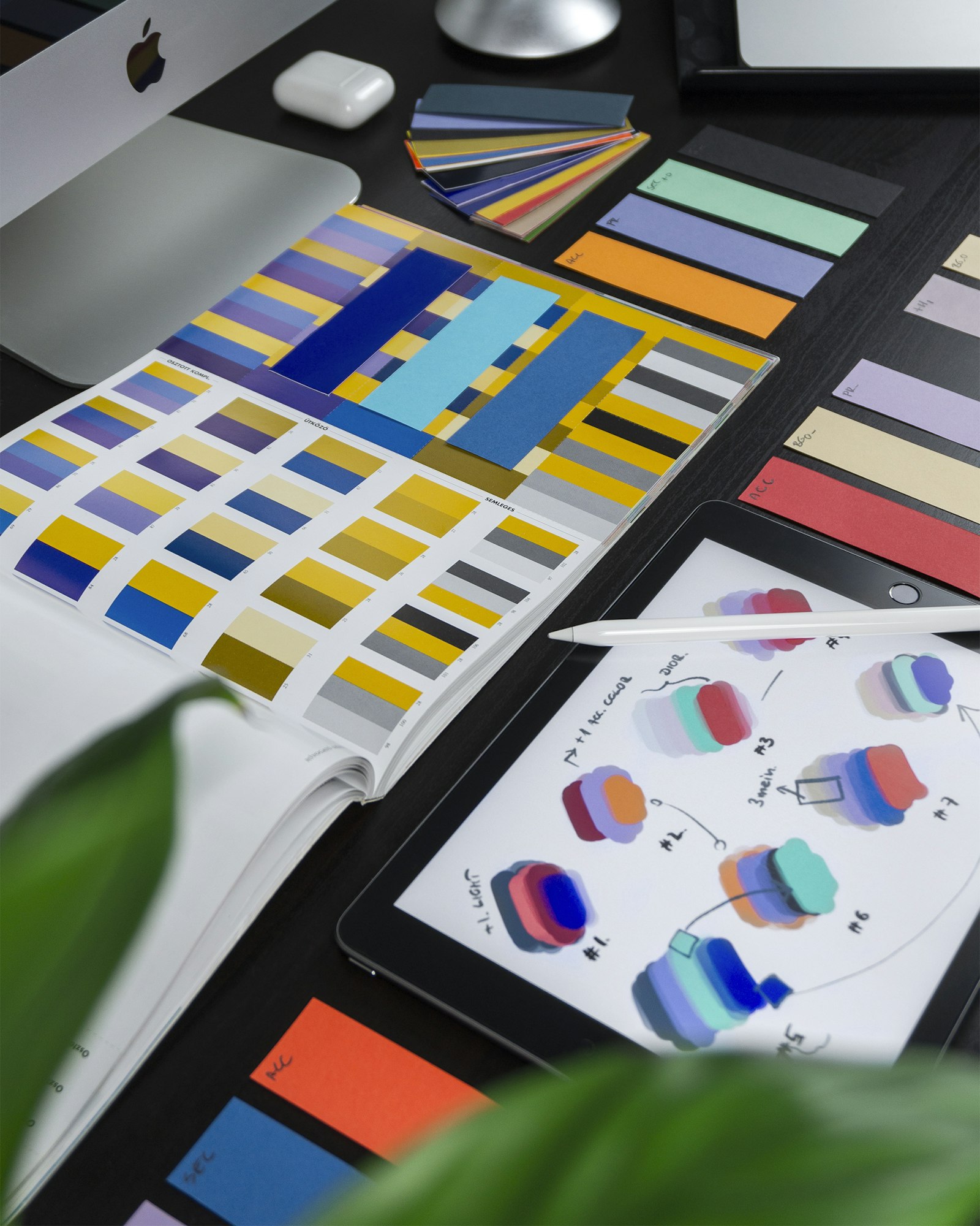
Every designer hits this at least once: the orange that glowed on the monitor comes back from the press looking flat. Nothing went wrong — the two devices simply build colour in opposite ways.
Light adds, ink subtracts
A screen starts black and adds red, green and blue light. Paper starts white and subtracts light with cyan, magenta, yellow and black ink. Some RGB values, especially saturated oranges, greens and blues, simply have no CMYK equivalent. The press picks the closest ink mix it can reach, which is why the result reads duller.
Convert before you approve, not after
If you convert to CMYK yourself, you see the shift on your own screen and can correct it. If you hand over an RGB file, the RIP converts it for you and you find out at delivery. Always work in a CMYK document for print, and soft-proof with the profile your printer uses.
When a colour must be exact
Brand colours that have to match every time belong in a spot ink. A Pantone spot colour is mixed as a single ink rather than built from four, so it reproduces identically on every run and on every substrate. It costs an extra plate, and for a logo it is almost always worth it.
A short checklist
- Set the document to CMYK before you start designing, not at export.
- Keep total ink coverage under 300% so the sheet dries properly.
- Build rich black as C60 M40 Y40 K100 for large solid areas.
- Use pure K100 for small body text so it stays sharp.
- Ask for a physical proof on the actual stock for anything brand critical.
Send us your file and we will run a free pre-press check before anything touches a plate.